Dexcom E-Commerce Project

Due to NDA, I have to lock the project.
If you're interested, please refer to resume for passcode.
Or scroll down for a brief overview

It takes a while to load, so thanks for your patience!

OVERVIEW

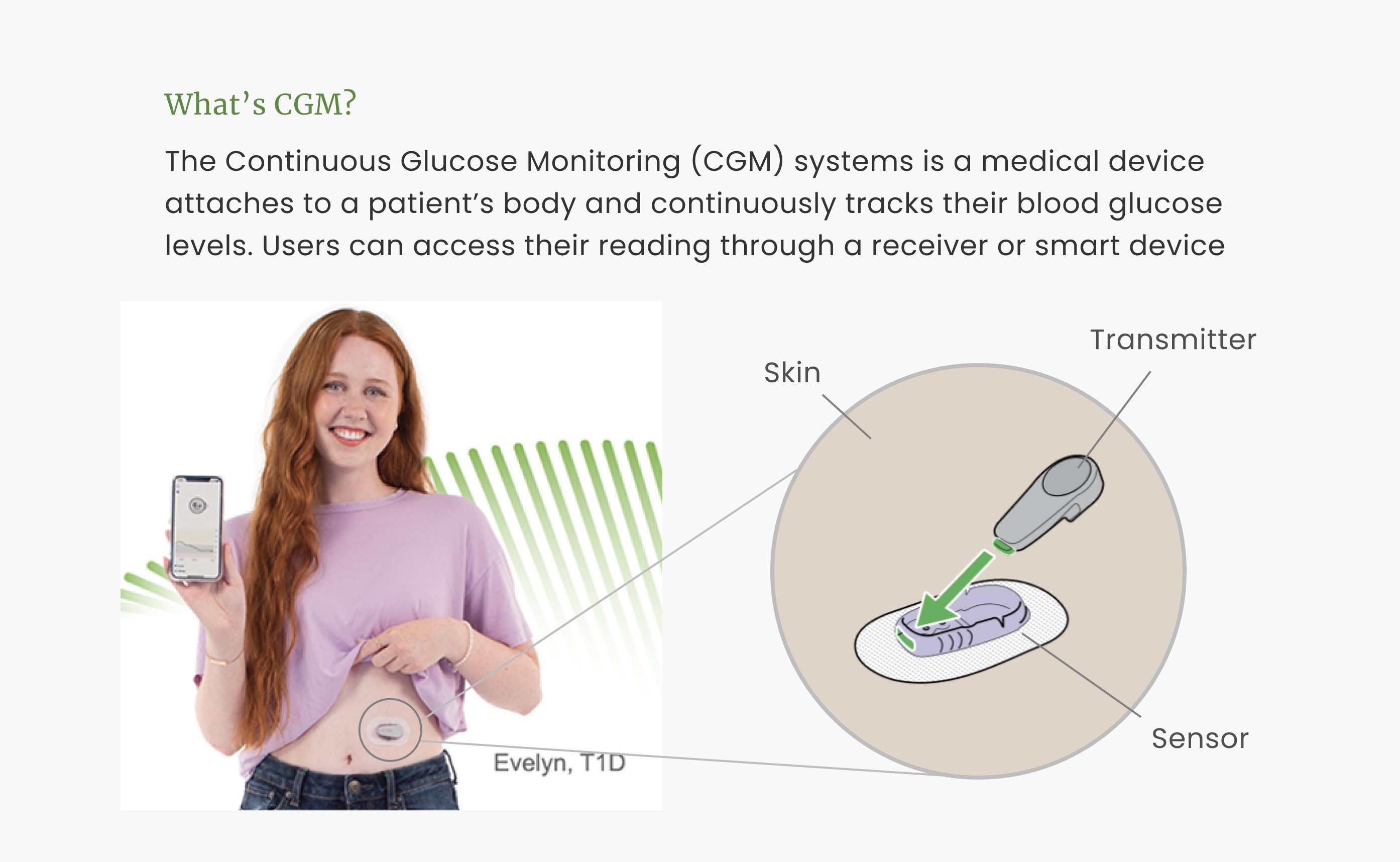
CGM
DESIGN PROGRESS
UI/UX Design Lead & Product Designer in challenging yet productive 10 weeks
sprint progress
THE CHALLENGE
Improve online purchases experience for Canadian users.

There is a constant need for Dexcom users to order/reorder because, to ensure the data accuracy, Dexcom suggests users to replace the sensor every 10 days and the transmitter every 3 months.

  • Non-subscription users
    They will have to (re)order regularly from Dexcom website to make sure they have enough inventory.
  • Subscription users
    They get auto-payment and auto-shipment from Dexcom but would might need to order online from time to time to have backups.


Currently, Dexcom shop is only available on browser, which requires patients to be near a desktop or go to website on their phone, log onto their account, find the shop, add products and go through the process to check out...
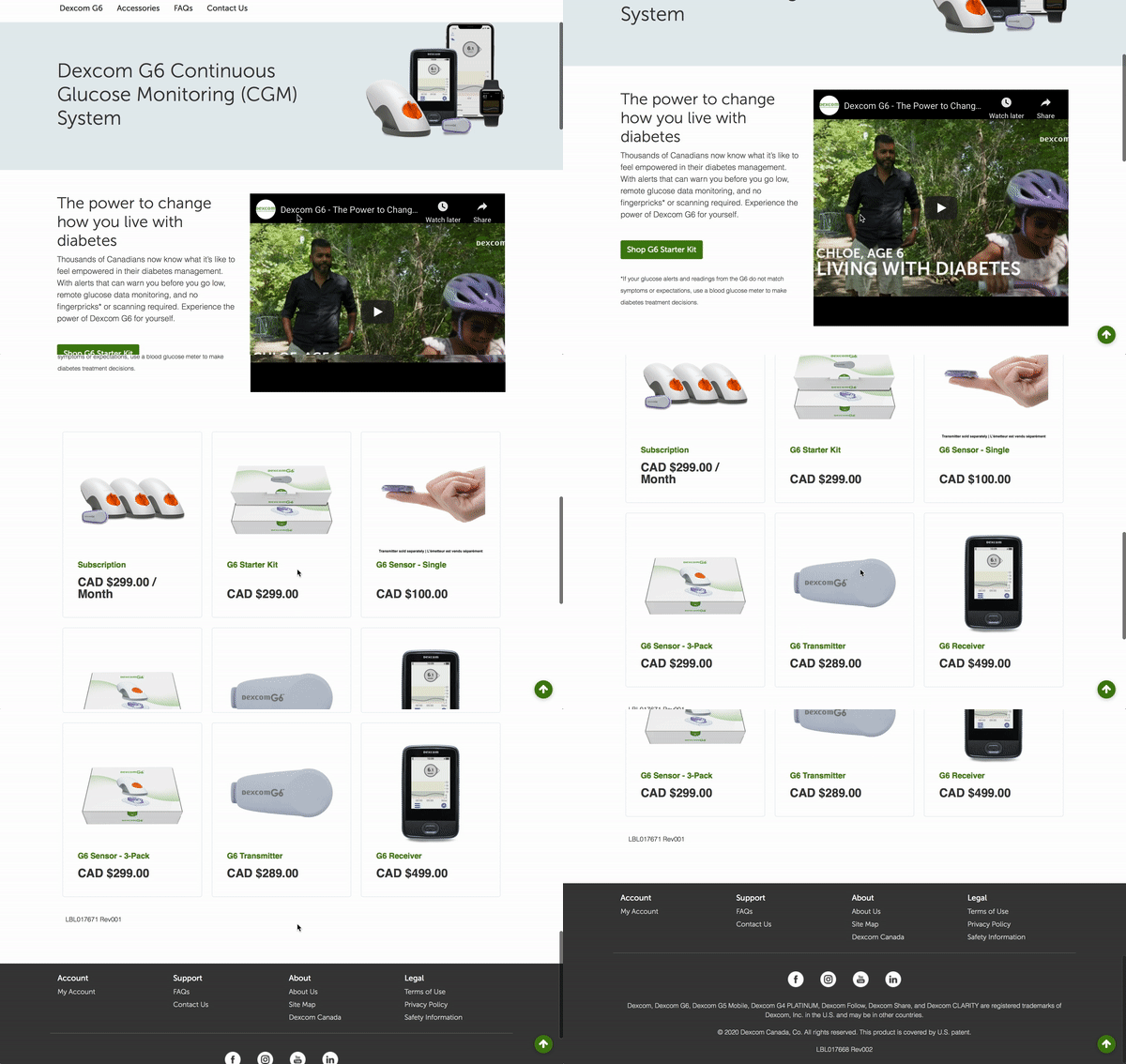
online shop


Therefore, the shopping experience is essential for Dexcom users for frequent and/or occasional visits. As patients with diabetes are already suffering from mental stress caused by the diseases, so our team was asked to relieve their stress by designing a new way to simplify the shopping process. And incorporating the business goal of Dexcom, our problem statement was:

How might we build a straightforward & transparent shopping experience to increase sales & user loyalty?
SOLUTION BRIEF
Customized shopping experience with greater flexbility

Due to privacy agreements, I would not be able to share the detailed design process nor explain the exact design decisions and strategies on different iterations of prototypes. But overall, the general direction we focused on were:

solution brief


* Images are blurred for confidentiality.
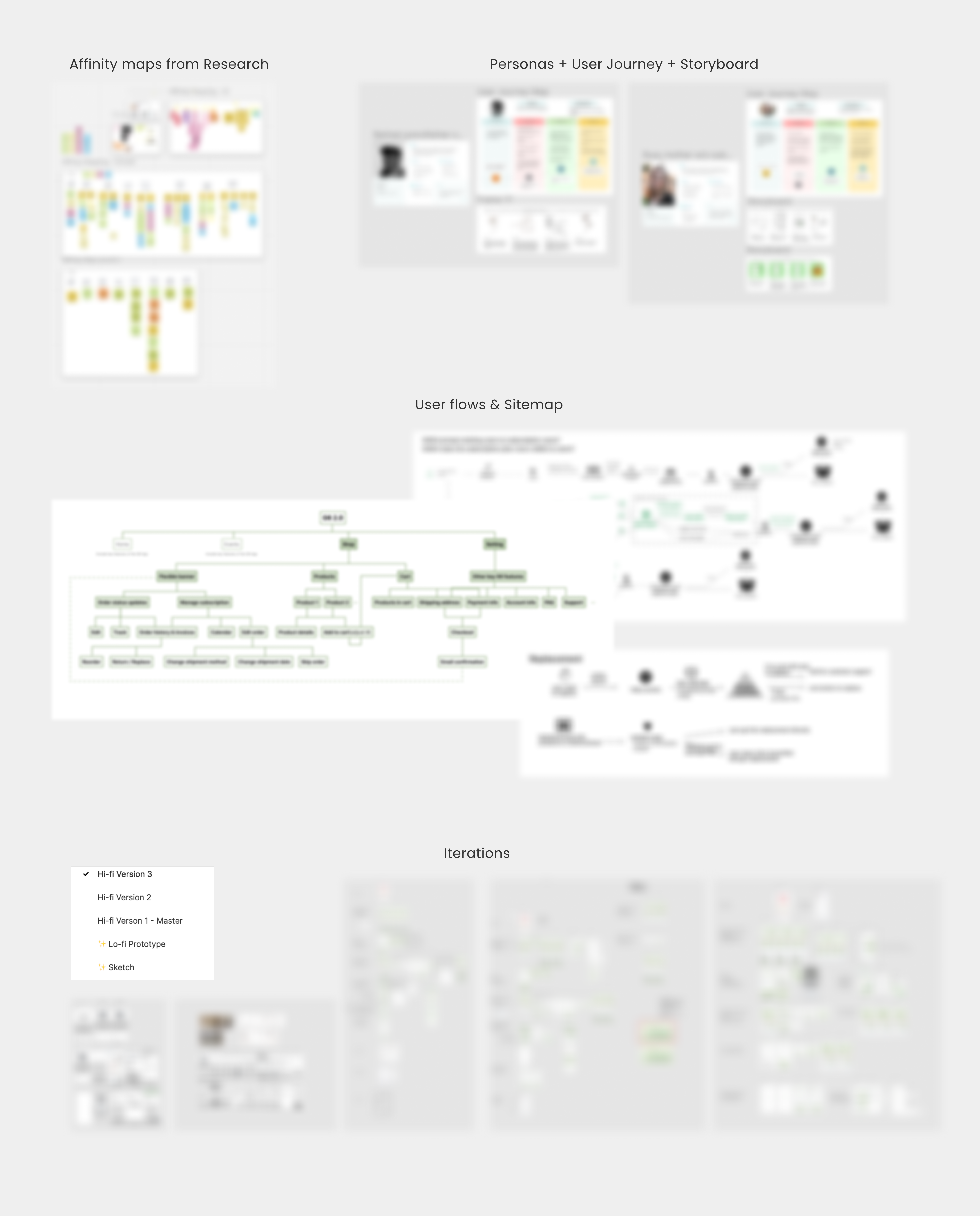
blurred process

Interested in learning more? Input the passcode to get the full picture :)
ACHIEVEMENTS
“When can I see the product?”

After presenting our ideas to over 30 Dexcom stakeholders, they were very impressed by the comprehensiveness and thoroughness of our research and designs. Our project was handed off to Dexcom professionals & won development approval.

achievement
bar

“Kudos for going beyond the design brief and thinking about how it would be integrated [...] Really solid!"


Alex Diener, Senior Director Of User Experience Design at Dexcom


bar

" I mentored Ali on an e-commerce design project for her internship Dexcom. Ali was great to work with. The task at hand was not a simple one, yet she was very inquisitive, and receptive to guidance and feedback at the early stages of the engagement. I was meaningfully impressed with the designs she and her team were able to produce within the time allotted. Well done Ali - keep it up! "


Caroline Goodman, Senior Director, Global E-Commerce at Dexcom

TAKEAWAYS
Think broad, then deep
The mentorships from industry professionals with different background have provided me with different angles of the shopping experience of customers. These allowed me to consider different user scenarios more thoroughtly with questions like “What if users want to...” or “What’s next...”. The diversified personas have also prompted me to think deeper for each potential use case for each customer segment.
Communication needs to be human centered designed as well
I’ve learned that being a designer is not just about pixel perfect UI designs. Through weekly meetings with DDI and Dexcom mentors, learned that it’s more about how to present what people would care the most about: who are the audiences, what do they care, and why the design fits their interests. I learned to be more considerable about word choices, questions type, and presentation formats.
Good design is all about tradeoffs
The biggest design challenge I faced was to align the customers’ needs with business visions. As I was starting on the prototypes, I realized that some features will benefit users but might not best serve the business goals. So I jot down a list of great features to implement based on user needs and performed “buy a feature exercise” with the Dexcom mentors to help priorize those features. Therefore, I would be able to make informed tradeoffs in design accordingly.


group photo

A big shout out to the amazing mentors and teammates
who have taught me so much over the 10 weeks!!