Learn Diabetes
An interactive visualization tool for diabetes education in the community
Across the 9 weeks span, I've learned from enormous perspectives.
As Team Lead
UX Researcher & Designer
Front-end Developer
Do you know how many carbohydrates are in a regular apple? Milk? A chocolate croissant?
And do you know how much insulin you would need to counter the effect of those carbohydrates?

Imagine that you have to count calories for every single thing you eat and calculate the
amount of insulin to inject before you start eating.
Through our interactions with Patients with Type 1 Diabetes and professional diabetes educators/ endocrinologists,
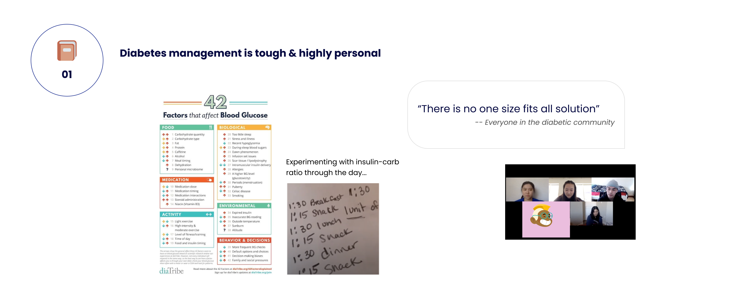
we know that patients rely heavily on trial and error & experiment on their own body to figure out
how to manage diabetes. How can we help them in this case?
1. Utilized exisiting resources at its best!
We had a good start with previous teams working on the project about insulin timing and dosing
through visualization, which proved to be working during our less formal user testings.
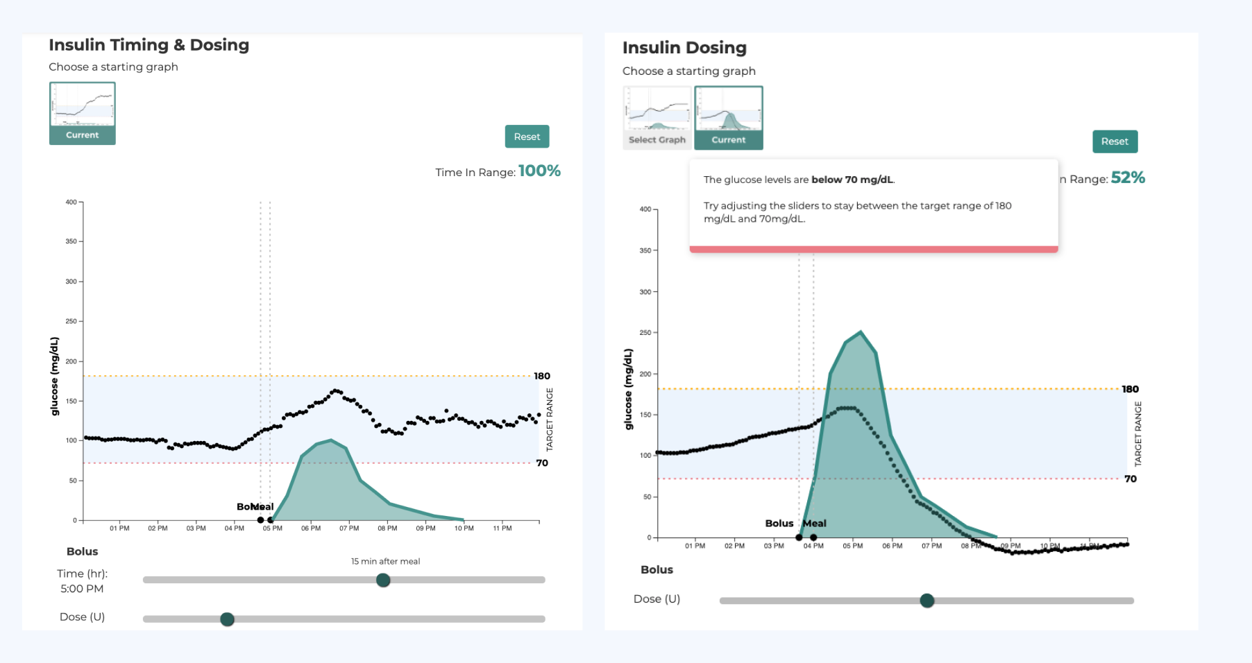
But only education about insulin is not enough.
After interviewing with 2 previous members, we refined our problem statement into:
2. Valuable inputs from in-depth Interviews through iterating scripts
To study more in-depth about the struggles, we conducted 13 interviews with people with different
expertises in learning and teaching diabetes.
Here, I led the team to iterate on the scripts by turning general question to scenario-based questions to get
the just-right information we needed:
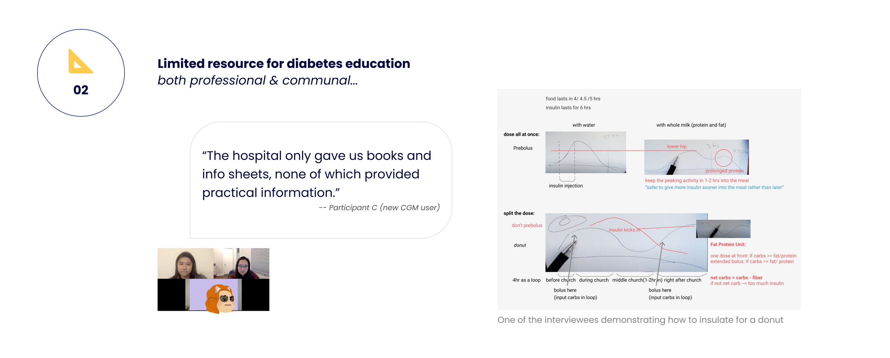
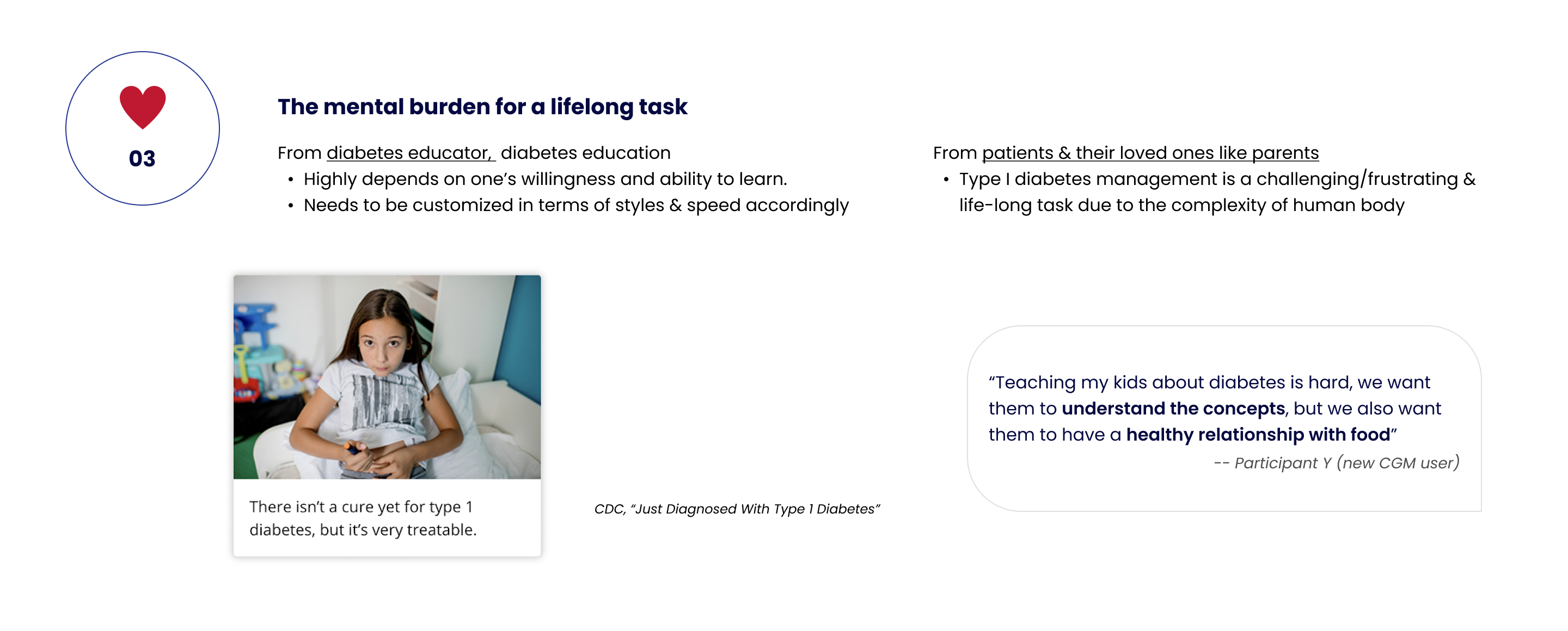
The new questions set worked pretty well and we were able to identify the 3 main pain points that the diabetic community struggles with:
To move forward, we wanted to further synthesize the data by turning narrative stories into understandable pedagogy.
After pointing out that affinity map might not work in this case to the team, I constructed our questions and reached
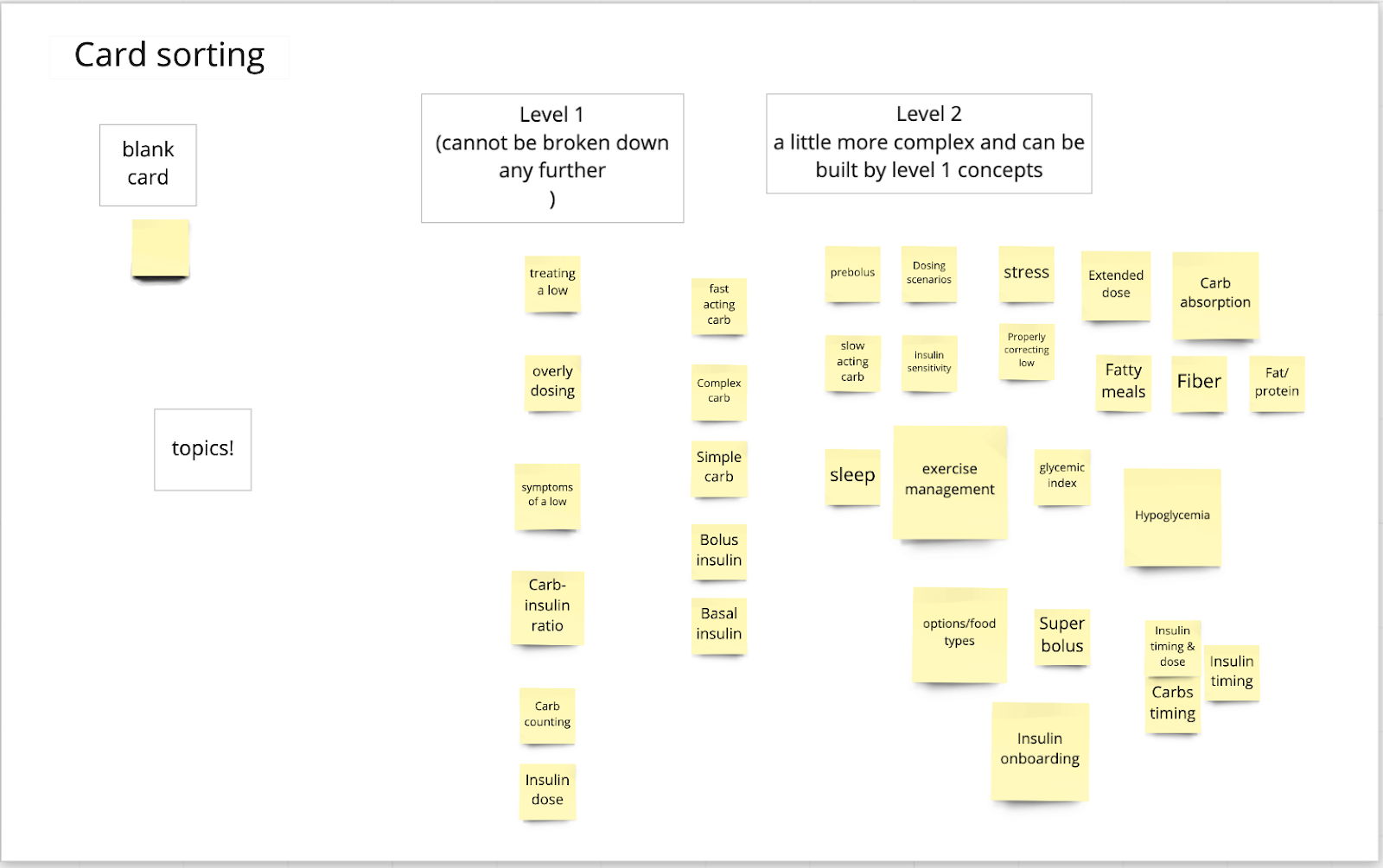
out for mentors' help during weekly standup meeting. Eventually, the team were able to refine our topics of interest and hierarchy of teaching
by conductng card sorting exercise with our interviewees.
With all the information at hand, I worked with another product designer Ed, trying to
integrate the scattered information in a more systematic way.
While talking with him about all the previous artifacts,
I was inspired to come up with this "Breakdown and Buildup Framework".
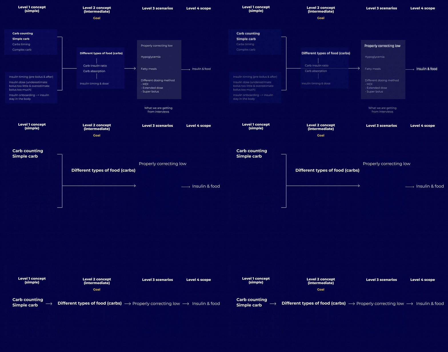
The original one was much more complex as shown in the gif, but after consulting with our mentors and refining it as a team, we made a huge progress by having the framework only focus on simple carbohydrates and carb amounts.

By providing examples on really basic concepts, we help people
with different expertise familize the tool so that they are prepared
for more advance personalized and customized education.
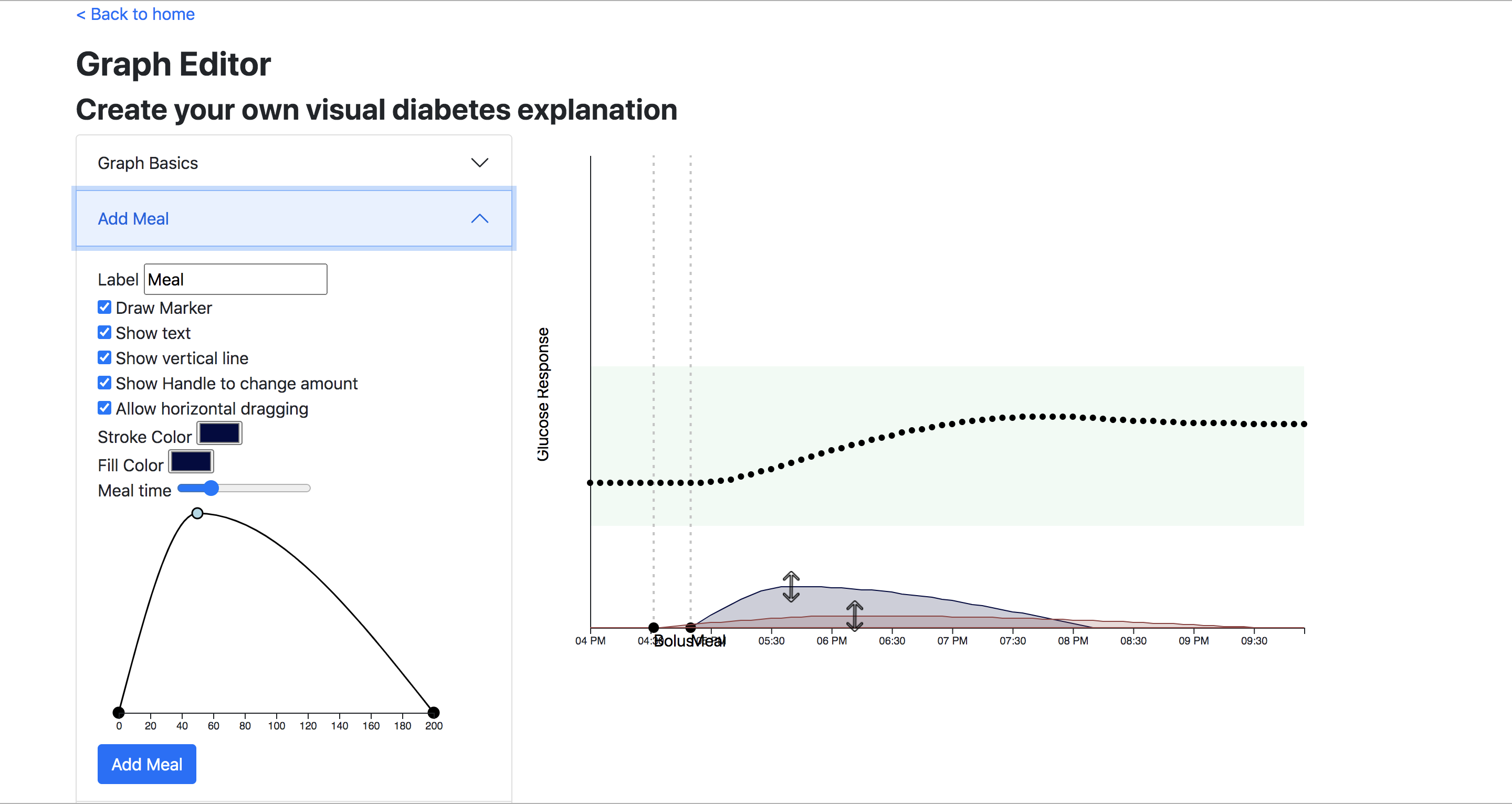
People who has more experience in managing T1D now can create
customized graph based on their need to educate those who has less experience.
From research we know that people with diabetes are overwhelmed by the complexity of interconnected knowledge and subjected to emotional fatigue, the 3 Design principles we came up aimed to tackle those problems:
Based on our framework, we try NOT to overwhelm people, especially those who
are newly diagnosed with diabetes.
The way we try to deal with
that is to simplify the cognitive load and shorten the learning curve for people by
having one main interaction at a time.
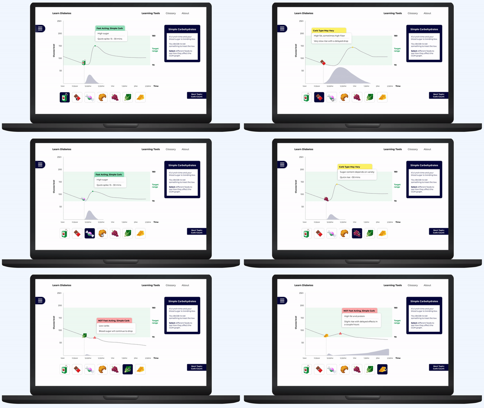
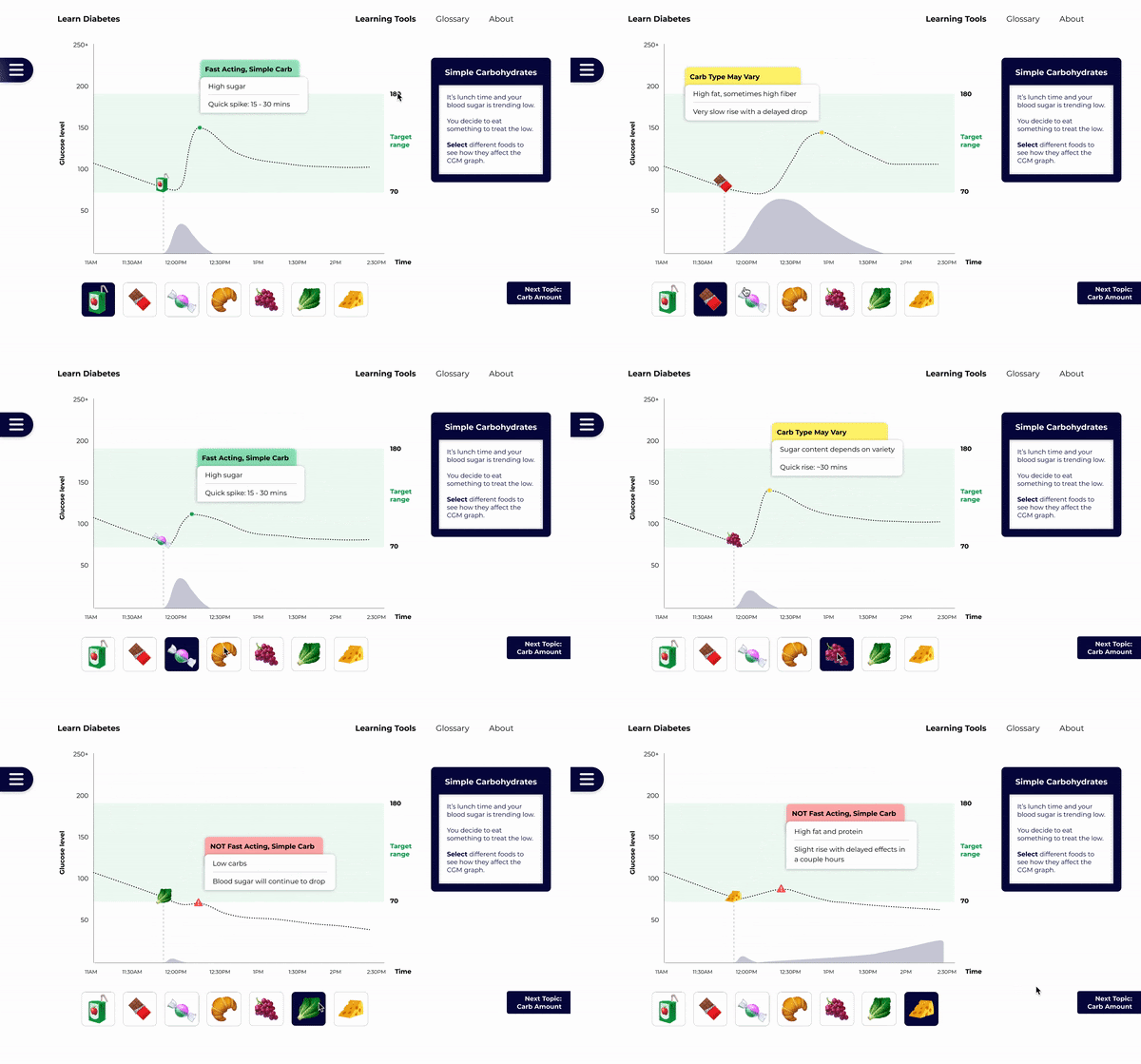
Users can select different types of food to learn about simple carbohydrates
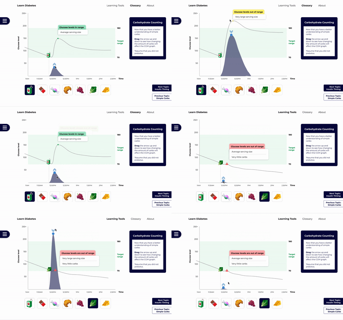
Users can drag to to adjust the amount to learn about Carb Counting (without exact numeric numbers to avoid giving medical advice)
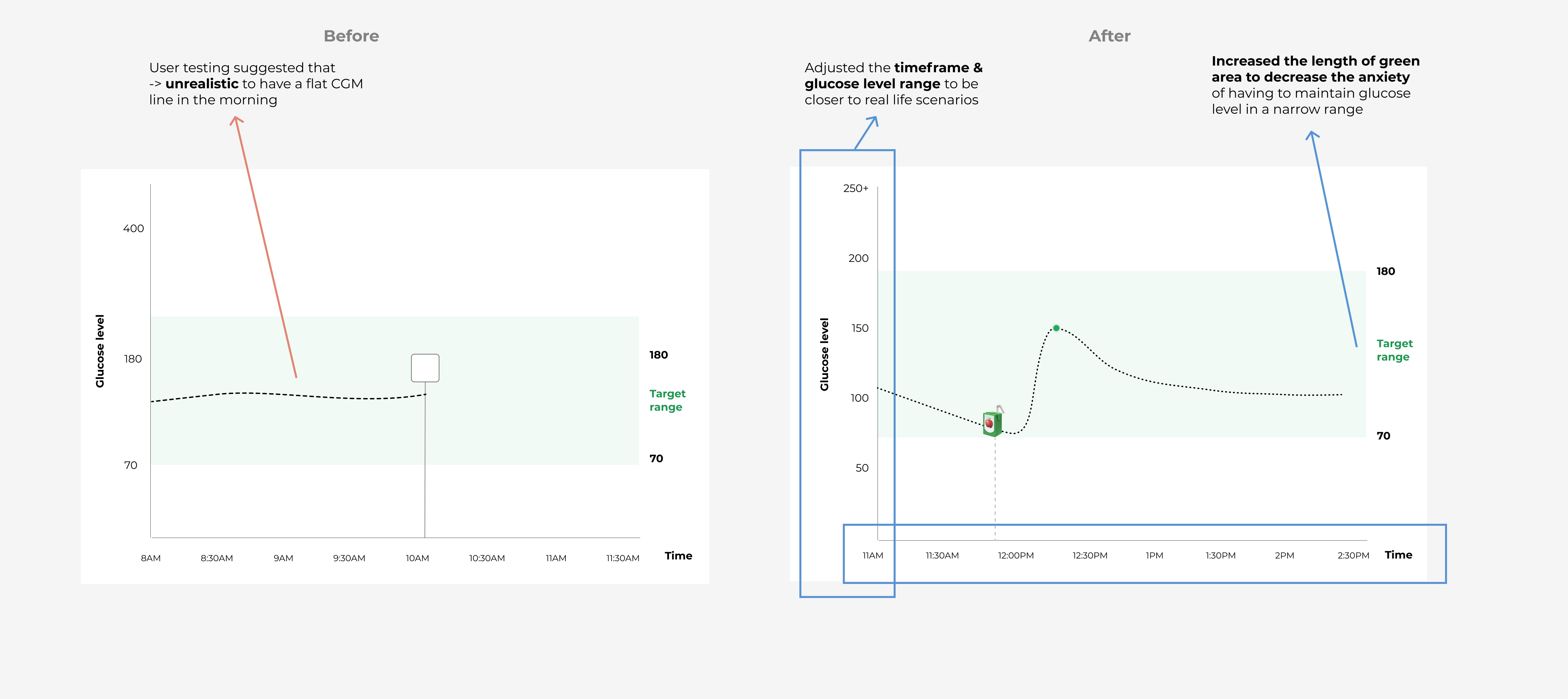
As learning diabetes is a really personal and complex journey,
the tool aims to represent a general yet realistic scenario that
could people with diabetes can feel related.
Through interacting
with the graph, people with diabetes will
learn and remember the concepts from the exmaple and be able to implement that same
logic when managing their diabetes.
The third main pain point was the mental burden that people with diabetes and their loved ones bear.
That was why we paid extra attention to use as accurate and consice as possible for the language in the note.
We also wanted to make sure the tool is accessible to all.


Thank you for viewing all the way!
What is really cool about
the project was that it actually got implemented to distribute to the diabetic community!
What we heard from the community:
Note that, due to short in time and resources, there might be differences between the real
site and the intended design.