Pangea internship
Defined design process of components in design system library & reskinned the whole both desktop & app while wrote detailed documentation
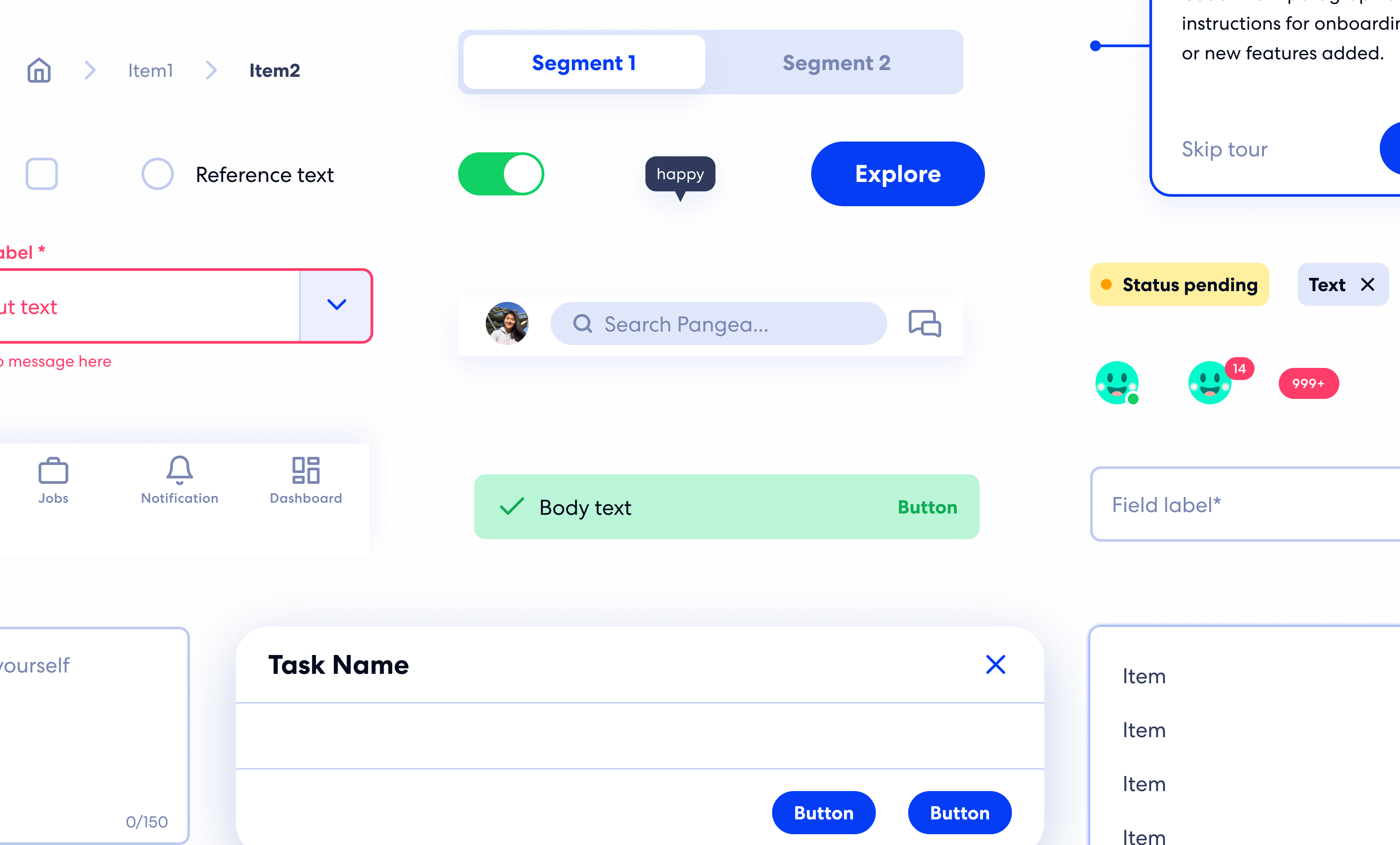
To improve the efficiency of work of future designers and communication with the devs team,
the design lead started to build a design system and name it Panthalassa, the superocean that surrounded the supercontinent, Pangea ;)
As I joined the team, previous designers has set up a basic style guide for foundational elements like color, typography, spacing and layout grid etc.
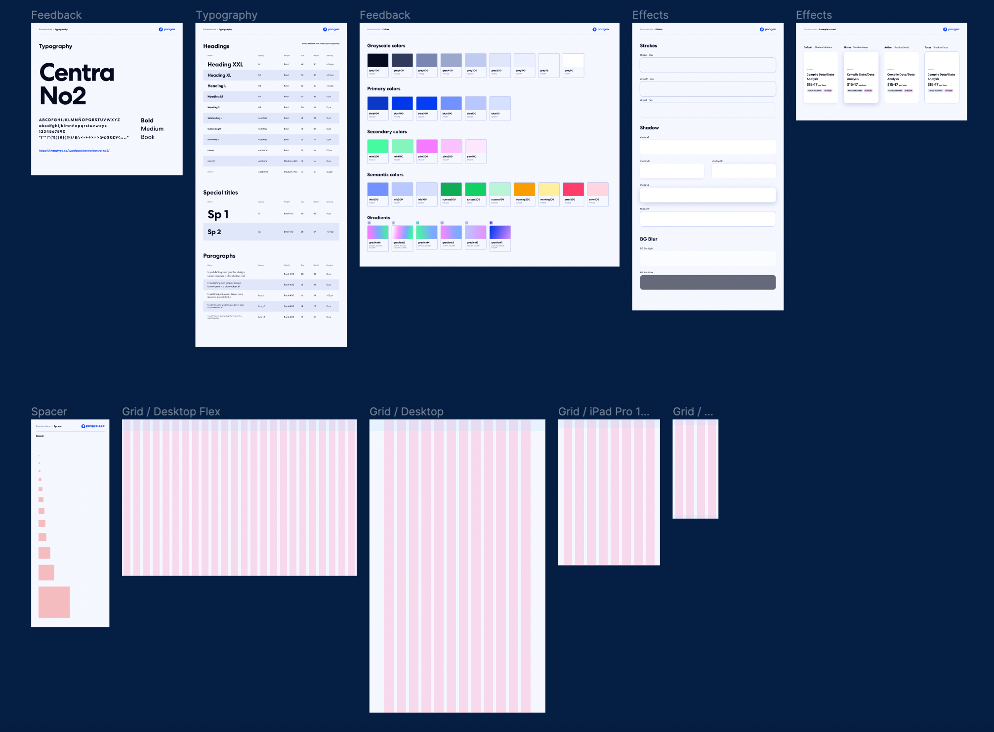
My job was to build and implement
components in the correct way such that
Not to reinvent the wheel, our design lead refer to established design systems like Adobe Spectrum, Google Material Design and Apple's design guideline when defining our reusable components.
To get familiar with the previous style guide at first, I took the initiative to replicate
some of the main pages of the website.
It was when I realized that the Avatar component was a bit confusing and inflexible to use.
To figure out how exactly I can improve the component setup, I first asked about the tech stack being used trying to synchronize the setup in Figma with the setup in coding.
Knowing that the front-end tech stack is React, I referred to
Material UI React for setting variants, like adding image, letter, and square shape for flexible usage and fallback avatar.
With better categorization of type, property, state and size, both designers and developers now can better understand and reuse the Avatar component easily.
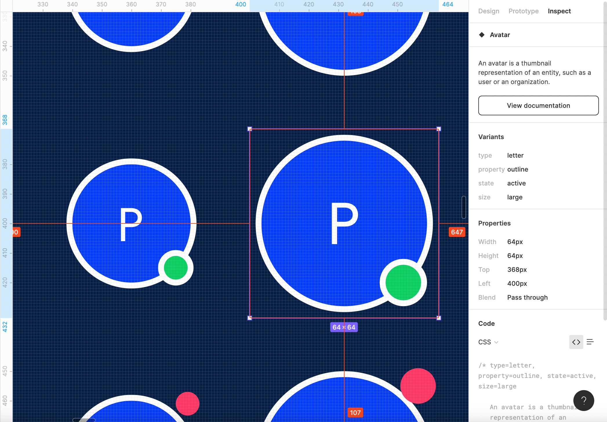
Thanks to this cool feature on Figma, developers just need to click on the variants and view the clear setup and documentation linked!
One of the most effort-taking tasks is to make sure that all the components are not only reusable for
most use cases but also compatible for different screen sizes.
By setting up the container frame
consistently & constraints of the components correctly, it efficiently and effectively makes
design transferable to create the seamless experience for both desktop and mobile users.
It's also a great foundation for developers to implement and
designers to get creative with the basics.
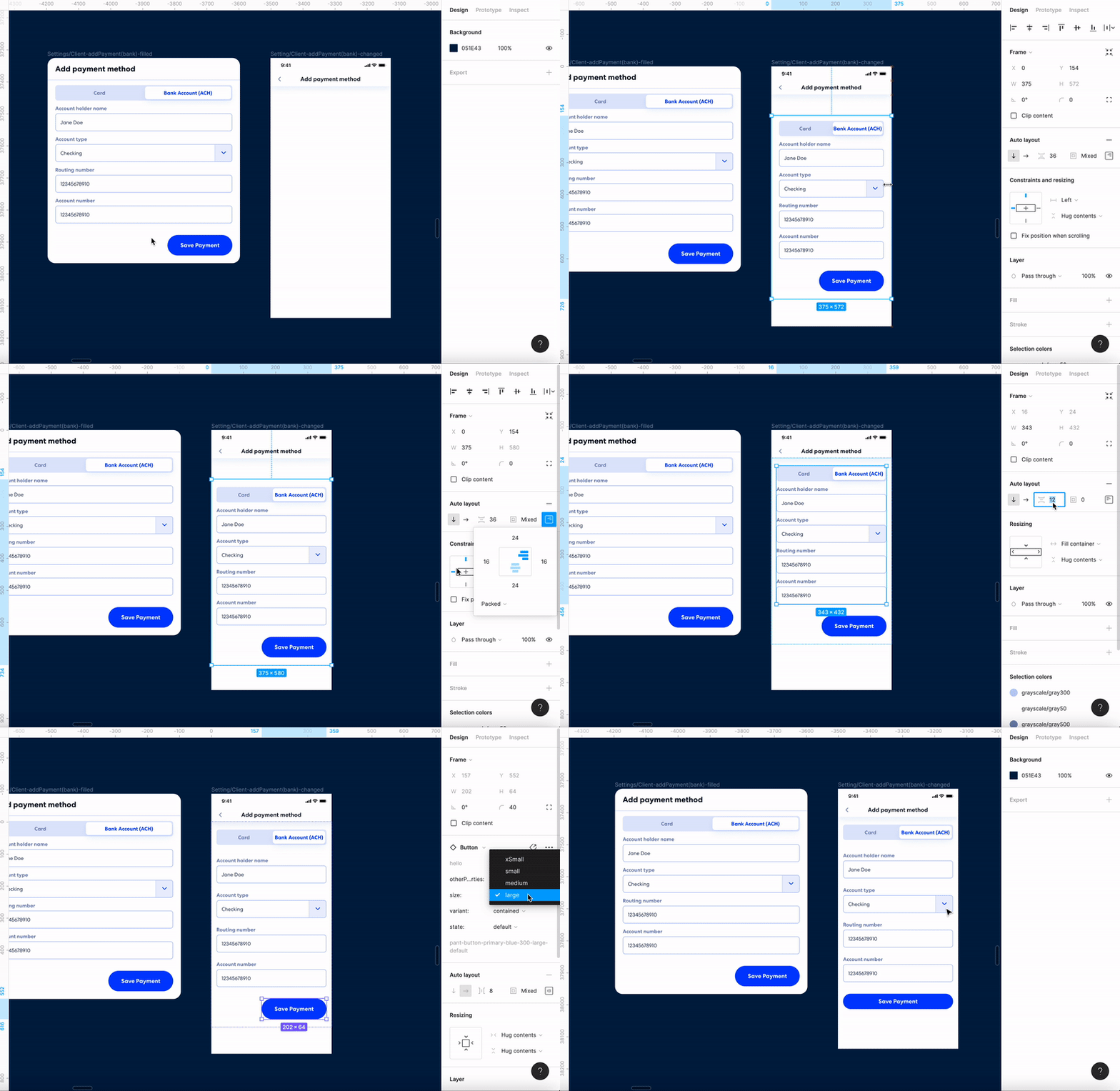
Tranferring desktop to mobile design in ~30 sec
Currently, the developer team is building the components along with the documentation on Coda.
The team is gradually shipping the system into the real desktop and mobile app!
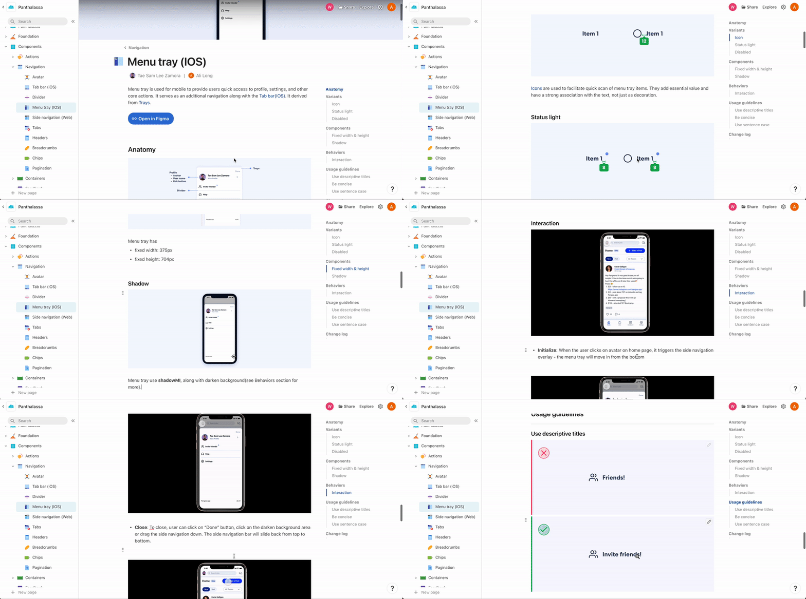
A peek of the documentation